Key takeaways:
- What is a client intake form? A client intake form gathers client needs and preferences, facilitating personalized business interactions and improving the customer experience.
- What are the key elements of an effective client intake form? Essential elements include basic contact info, a clean layout, appealing design, and technology like auto-populating fields and electronic signatures.
- How can businesses enhance form completion rates? Implement features like progress indicators, offer support, and regularly update the form based on client feedback to improve user experience.
- What metrics measure the success of a client intake form? Analyze completion rates, abandonment rates, and client feedback to identify areas for improvement and enhance overall user satisfaction.
- How can Wrike assist in managing client intake forms? Wrike offers custom forms, automation features, and approval software, promoting streamlined communication and a better client experience.
There are many ways to dive into the dating world, be it through mutual friends, a random encounter at the library, or a dating app. Nowadays, singletons can try their luck by filling out an online form on a dating app.
An online dating form lets you express any likes or dislikes, so you can be matched with any potential beaus that fulfill your expectations. Instead of having to meet in person and possibly suffer through a monotonous conversation, you can use these forms to quickly filter out partners who don’t meet your requirements. Finally, that tall, handsome athlete who enjoys sunset walks on the beach or that nerdy, quiet bookworm who fancies a picnic at the park is within reach.
Whether it’s someone’s height, appearance, hobbies, or life goals that concern you, an online dating application can be your best friend. All it takes is a couple of minutes of your time and a quick upload of some recent photos of yourself. Now you’re ready to find the person of your dreams!
When it comes to business, companies are on the lookout for potential clients that they can bring over to their side. Their version of an online dating application manifests as a client intake form. Often the first point of contact with a client, this tool is specifically designed to gather a customer’s needs, preferences, and requirements, while ensuring a seamless experience.
In this article, we will explore the importance of a client intake form, its key elements, and how to design effective forms, among other things.
What is a client intake form?
A client intake form bridges the gap between the business and the customer. Companies can use this form to ’cross over’ into the client’s world and collect important details about their needs, preferences, and objectives. They can then take this information and incorporate it into their products, services, and overall customer experience.
For instance, businesses can reach out to customers and offer them personalized discounts on products that match the goals and concerns mentioned in the client intake form. This signals to the client that the business is indeed listening to their needs. As a result, they will be more inclined to make a purchase and maybe even become a repeat customer in the future!

The key elements
Let’s take a look at several elements that make up an effective client intake form. Remember, the goal is to craft a form that makes it easy for your company to gather key client information.
The essentials
Ask for basic contact and demographic information, e.g., name, email address, phone number, age, location, and industry.
Depending on the nature of your business, you can also request extra details. While marketing agencies would benefit from understanding the client’s target audience, current marketing strategies, and future goals, law firms should ask about the client’s legal history, current legal disputes (if any), and their desired outcome.
Layout
Avoid clutter and focus — create a clean and organized design that is easy to read and navigate. Separate your content into sections using headings, subheadings, and white space where necessary. Also, don’t forget to use checkboxes, drop-down menus, and radio buttons to make the data entry process go by faster.
Imagine you are walking on a tightrope and trying to remain balanced. You don’t want your form to be too long, as these can be overwhelming and discourage potential clients from completing them. Likewise, noticeably short forms may not be effective in collecting all the required information. Try to shoot for the sweet spot — something in the middle.
Design
Select visually appealing colors that align with your brand identity. Use fonts that are easy to read and be consistent throughout your form. If necessary, you can bold or italicize text to highlight important instructions.
Try not to go overboard with your design. While your colors should attract the customer’s attention, they should not be too flashy in case they distract from the actual content of the form.
Technology
Boost your form’s user-friendliness and make it accessible from any device.
- Auto-populating fields will automatically fill in information that clients previously input. This saves time and is a great help to your returning customers.
- Data validation guarantees that users use the correct format for specific fields (e.g., email addresses and phone numbers). This keeps your data accurate and the number of errors low.
- Electronic signatures let customers digitally sign the form at the very end. Not only are you skipping the time-consuming process of printing, signing, and scanning, but you are also reducing paper waste. Go green!
- Integrate your form with CRM systems or other customer databases. You will be able to automatically transfer the collected data into existing systems and analyze client demographics, preferences, and trends.

How to implement your client intake form
Now that you have an idea of what goes in a client intake form, let’s see how the process of implementing it works. Be sure to follow these guidelines:
- Before finalizing your form, do a final quality check.
- Verify that the form aligns with your company’s branding and overall user experience. Check all of the visual elements, including logos, colors, and typography used. Remember, the last thing you want is for the customer to confuse your business with a competitor’s!
- If desired, implement a user-friendly interface that simplifies the form completion process. For instance, you can bold keywords or phrases and provide helpful hints in a different color.
- When introducing the form into the onboarding process, be clear and bring your A-game to the client. Explain why the form matters, its benefits, and how to complete it. Also, provide support channels (e.g., FAQs or a dedicated customer support team) in case they get stuck while filling out the form.
Even if you do things right and follow all of our guidelines, there’s a chance you may still run into some roadblocks. Some of the most common issues are low form completion rates or problems with data accuracy.
Here are several ways to take action so that you don’t lose out on any potential customers:
- Collect feedback from clients who have completed the form. Use the positives and negatives that they experienced to make some improvements.
- Analyze form analytics to see the numbers on completion rates, drop-off points, and overall user behavior. If there are any patterns or bottlenecks, take note so you can eliminate these issues.
- Implement features like progress indicators or save-and-continue functionality to enhance the user experience. These tools encourage your customers to complete the form at their own pace and let them know how close they are to finishing.
- Regularly update your form to adapt it to your business and client needs, as these two factors tend to evolve over time. An easy way to think of this is making the no-brainer decision to switch to electronic rather than paper mail correspondence when engaging with your customers.
How to measure the success of your client intake form
Remember to take the time to gauge how successful your client intake form is, so you can see where you can get better. Otherwise, it’s like setting goals and not following up on the result.
Here are some strategies that can help you analyze your form:
- Ask your clients to provide feedback on difficulties and suggestions for improvement.
- Picture a customer who has just mentioned that they had to guess on several questions since they were not clear. Your company should respond by editing the wording of each question. Here’s a tip — if it sounds weird when you read it out loud, you need to fix it.
- Review the form’s performance metrics (e.g., completion rates, time spent on the form, and abandonment rates) to see what’s going well and what isn’t. After all, the numbers don’t lie.
- Let’s take a look at the completion rate. This metric tells you how user-friendly your form is. High completion rates suggest that your clients found it easy to navigate and complete, whereas a low completion rate is a cause for concern. Perhaps your form was too lengthy or confusing, leading your customers to abandon it.
- Based on client feedback and form performance metrics, make intentional changes to improve the overall customer experience.
- One thing you can do to simplify the form is trim the fat. Delete unnecessary questions and combine those that are similar.
Use Wrike to enhance the customer experience
If you want your customers to stick around, you need to make sure they have a fantastic experience, be it a virtual or an in-person one. When your clients are filling out your client intake form online, make sure that the form is giving them a good impression of your business.
With Wrike, you can manage your client intake forms effectively, ensuring streamlined communication and an improved customer experience.
A promising way to keep your customers happy, Wrike is home to a variety of features:
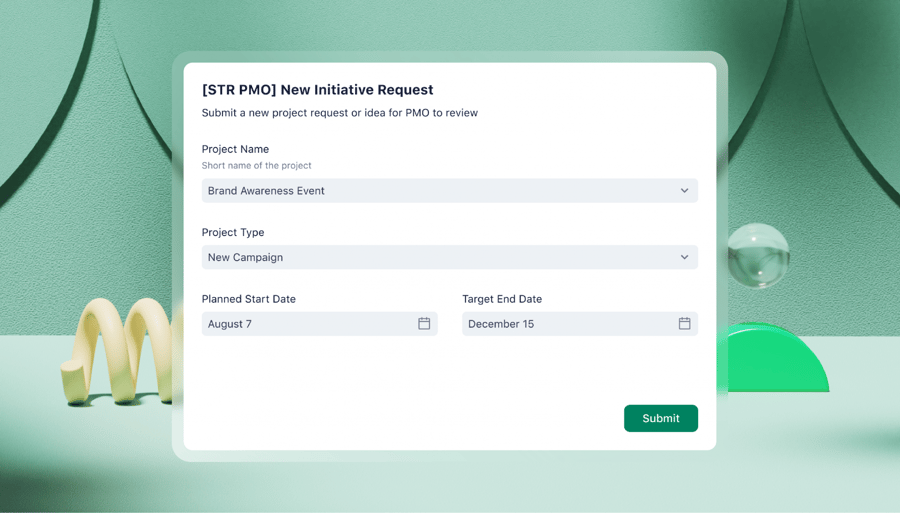
- Custom request forms to collect client feedback
- Approval software to get the green light on all form adjustments
- Automation to auto-assign client deliverables to a team member
Pleasing customers is tough. Doing so time and time again is even more difficult. If you’re looking for some speedy assistance, you’re in the right place. Start your free trial of Wrike today.
Note: This article was created with the assistance of an AI engine. It has been reviewed and revised by our team of experts to ensure accuracy and quality.


