-
For teams
-
MarketingStreamline proofing and reporting for seamless campaigns.
-
Creative & DesignCreate high-quality assets and get them approved in record time.
-
ProductAccelerate your product process, from idea to delivery.
-
Client ServicesExceed clients’ expectations with expert resources.
-
PMOAlign strategy with execution and deliver results.
-
See all teams
Workflows-
Campaign ManagementMake marketing magic with end-to-end campaign management.
-
Agency ManagementTake full control of your agency management processes.
-
Client Service DeliveryGet ahead of the competition with faster client services.
-
Product LifecycleWatch your product lifecycle flow, from concept to customer.
-
Project Portfolio ManagementManage your complete portfolio, from strategy to results.
-
See all workflows
For industries-
TechnologyBuild solutions that matter, and deliver faster.
-
ManufacturingEnhance operations, accelerate production, and empower teams.
-
Professional ServicesOrganize clients, streamline projects, and automate workflows.
-
FinanceDeliver better, faster financials with automations.
-
HealthcareCollaborate cross-functionally in a secure setting.
-
See all industries
-
-
Features
-
DashboardsFuel better, faster, data-driven decisions with powerful analytics.
-
AILearn about powerful AI and automations with Work Intelligence®.
-
Wrike WhiteboardTurn inspiration into execution with powerful visualization tools.
-
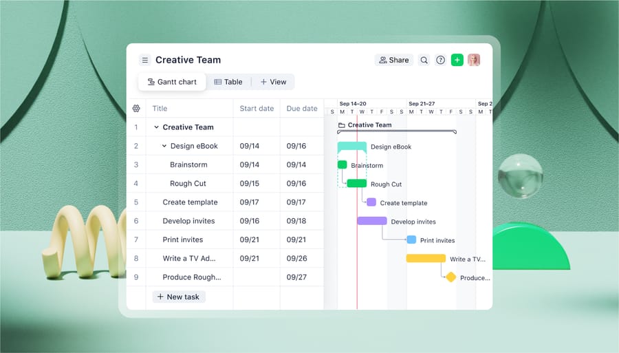
Gantt ChartsInteractive project scheduling across teams.
-
AutomationDefine and trigger automated workflows to eliminate manual efforts.
-
ProofingStreamlined proofing and collaboration in one place.
-
Project Resource PlanningPlan and allocate resources for timely delivery.
-
Project ViewsGet the full picture with customizable, intuitive project views.
-
Kanban BoardsInstantly view project progress and create customized workflows.
-
Dynamic Request FormsCustom forms powered by conditional logic.
-
ApprovalsKeep approvers in the loop from start to finish.
-
Custom Item TypesTailor work items to fit your specific workplace.
-
See all features
-
-
-
Workflow-Powered CollaborationSync with multiple teams to keep work flowing across your organization.
-
Industry-Leading SecurityWe're dedicated to safeguarding data beyond industry standards and ensuring secure collaboration.
-
Pioneering AI and InnovationPut the power of data and AI to work for your organization.
-
Invested in Customer SuccessWe support customers at every step of their journey from pre-sales to onboarding with 24/7 support.
-
Boundless ConfigurationCustomize your workspace to suit the unique needs of every team in your organization.
-
Effortless ScalabilityAdd new teams or adjust to rapid growth seamlessly with Wrike’s scalable platform.
-
-
Go deeper
-
Resource HubTop assets on productivity, collaboration, and more.
-
Wrike BlogLatest news and best practices on project management.
-
Educational GuidesGuides and tools to unlock better work management.
-
WebinarsJoin our live or on-demand sessions to do your best work.
-
Customer StoriesExplore Wrike’s case studies for key insights on customer success.
-
DevelopersConnect and build integrations with easy-to-use APIs.
-
- Enterprise
- Pricing


