Customers are at the heart of what we do at Wrike. Over the years, customers have provided feedback and valuable insights that have led to us releasing some of our best features to date. We love hearing their feedback and take every opportunity to highlight their experience and stories in case studies, testimonials, and our customer advocacy program Wrike Stars.
Today we’re highlighting Kelly Recinos, Project Coordinator for the creative department at Educational Insights, a 60-year-old educational toy company based in Torrance, CA that produces learning toys, games, and educational materials.
What department do you work in and how is your team structured?
KR: I’m the Project Coordinator for the creative department. We recently went through a massive growth spurt, which inspired us to look closely at our processes as we brought in new talent. We had Wrike blueprints already created from the previous year’s production cycles, so we dove right into process mode and built RACI charts for each type of asset we generate. We spoke with the stakeholders in every process and got their feedback. I then updated our request forms and blueprints to mirror more closely what actually happens during development. I use Responsible, Accountable, Consulted, and Informed custom fields in the blueprints to add the roles our stakeholders hold in each project.
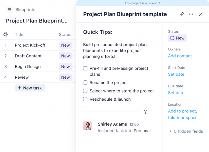
Since the infusion of new talent, we now have a brilliant copywriter and two widely skilled creative teams. Our digital team creates assets for marketing, social media, eCommerce, video, photography, and our website. Our print team designs packaging, guides, and products in tandem with the product development team along with catalogs and sales collateral of every type. Our Sr. Creative Director guides our brand strategy and ensures our design aligns with product positioning.
What is your job function? Describe a typical workday using Wrike.
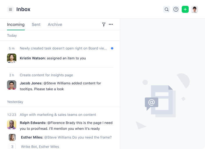
KR: I usually start every morning with my Wrike inbox. Most of the messages roll in before 9 a.m. and after 2 p.m. Clearing the inbox first thing in the morning gives me a few hours to attend to other priorities.
My inbox has three main priorities:
- Automated notifications: These alert the assignee (and me) of any potential risk. The triggers are tasks due in three days, approvals in review for three days, and anything overdue.
- New requests: We have a request form for each type of asset we create. I verify that we have the information needed to get to work right away. I either assign the tasks to the designers or hand them off to the design managers to alert them of anything new.
- Questions, comments, and general project management: After the first two priorities are addressed, I review all other messages that require my response or feedback so that work can continue moving forward.
After clearing my inbox, then it’s meetings, non-Wrike communication, and general project management. I spend a little time each day reviewing allocation so we can reassign tasks if necessary. For that, we’ve just started using Wrike effort to track capacity in our teams. At the moment we estimate, but I expect to track real numbers by this time next year.
Next, I check in with Wrike Stars to hear about updates and see what the black belts are up to. I get the best ideas from the workarounds and processes posted in Community. The rest of my time in Wrike is spent building or learning to refine tools and features.
Which Wrike features do you feel most comfortable using or most knowledgeable about?
KR: I love a really robust automated request form! Anything that provides the information we need to get right to work without multiple rounds of clarifying questions — that’s my kind of feature.
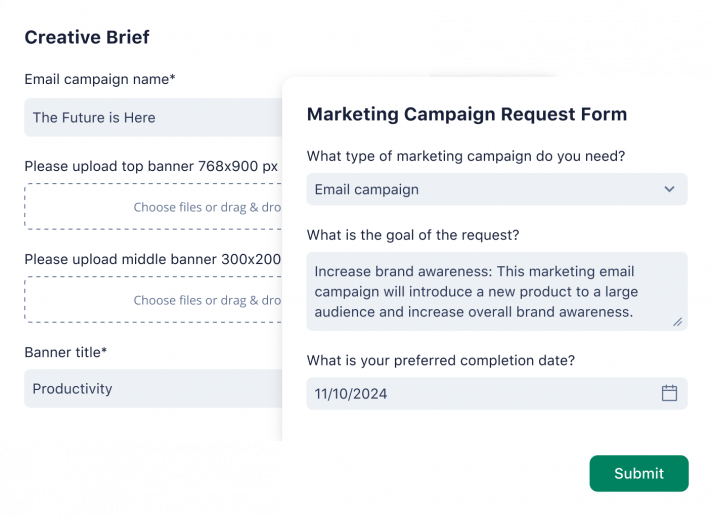
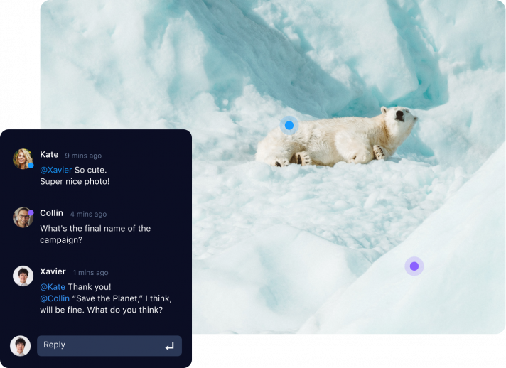
The project intake process is wonderful, but Wrike’s approval feature is what sold us on the platform four years ago. The ability to assign specific approvers to review a file with a deadline and notifications is helpful. An asynchronous review platform with tools to mark up the file and comments linked directly to the marks on the file? That’s a game-changer. The approval feature easily cuts 25% off the time it used to take us to review designs. Having all comments collected in iterative versions is the icing on the cake.
In the last six months, I have become a huge fan of Spaces. Each department now has a dedicated Space for better access in finding their files. Users can now see specifically what they need to see and not an avalanche of all the projects and tasks of the last four years. Since Wrike is very robust and includes a ton of useful functionality, I always build a “How to Use Your Space” guide with screenshots showing their views and tools.
What are 2-4 examples of processes you use Wrike to support?
KR: Our new product design work is seasonal. We start working on the new product line in March for release in September. Late summer is extremely busy as we are finishing packaging and product and submitting every piece for approval. At Educational Insights, 95% of our approvals happen in Wrike, with the final sign-off meeting being face-to-face with the executive team.
As we are finalizing the new product line, we are ramping up the marketing launch. Photography, video, eCommerce pages, website landing pages, GIFs, giveaways, every type of marketing asset, and thousands of words of marketing copy are captured and managed in Wrike. And that’s just the new product!
The digital team is working on these marketing assets for our existing product year-round. Our OEM team creates “exclusive” versions of our products for big retailers. OEM projects have a concept phase and a design phase so they needed a Space due to their interrupted product cycle. We create concept artwork the sales team presents to buyers at big retail stores. The concept project sits until we hear from the buyer. If the project is picked up, the concept goes to development immediately. The OEM team Space has a calendar for meetings, reports, folders for each product phase, and their user guide. When we have a very big project outside of standard production, I create a Space for it, so it doesn’t get mixed into the standardized requests.
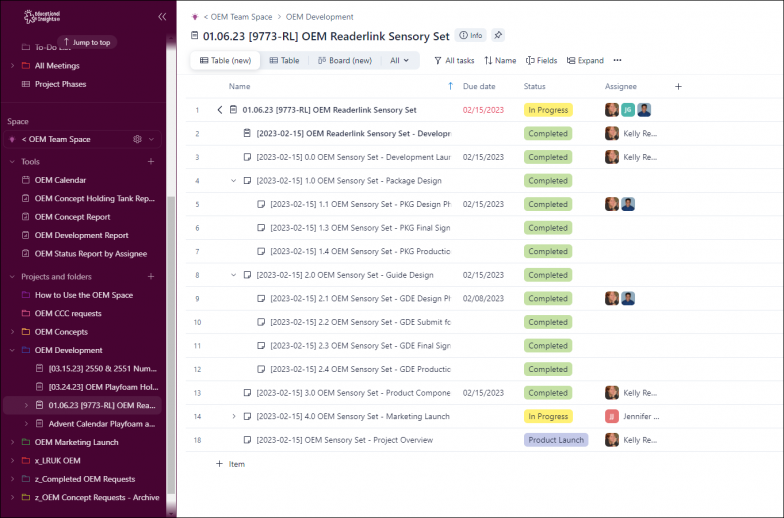
So far this year, we’ve designed the interior of our new office, written an enormous brand book, and launched a robot pet (Meet PYXEL!) each with its own dedicated Wrike Space. This year we started with Wrike Analyze and I spend as much time as possible learning how business intelligence streamlines project management. Recently, I earned the Wrike Report Mastery Silver certification and build analytics boards of all sorts looking for the best visuals to illustrate the work we’re doing.
Which Wrike features or use cases do you want to learn more about?
KR: Custom item types, in particular, because I use a recurring meeting template that creates three active tasks at a time. I created a meeting workflow and when I change the status to Next Meeting, a message is sent to the managers so they can add to the agenda.
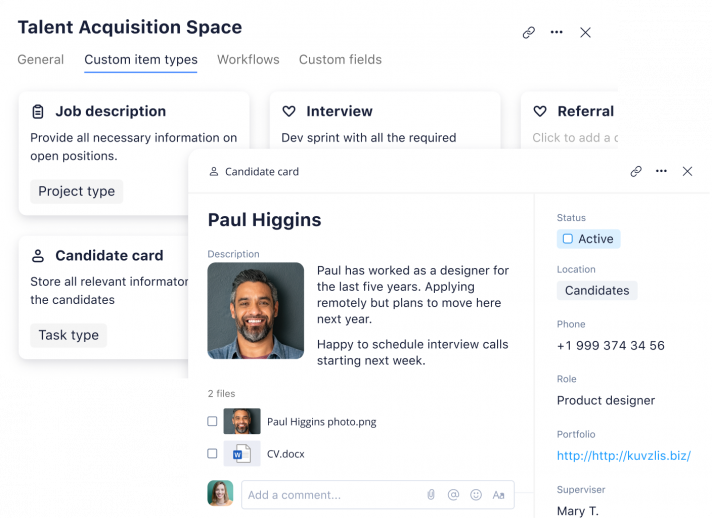
I’d like to create Custom item types for some of our quick-turnaround asset requests to make them simpler and differentiate them from other tasks. I need to see examples of ingenious Custom item type templates on their own, not just in Space templates.
I also want to keep up the continued development in dashboards and analytics board widgets. I haven’t even started to use all the fantastic new updates added this month, but I will because creating clean, visual stories for my stakeholders is critical to my success.
How do you Wrike?
Want to join Wrike Stars or be featured in a customer spotlight story? Join our exclusive customer advocacy program that celebrates top supporters! Once you’re a member, you can earn points, badges, and rewards by completing fun activities, participating in the Wrike Community, and amplifying the Wrike brand.


