Wrike dashboards are a window into your work, helping you see all your tasks, projects, and spaces at a glance — plus valuable insights with next-gen analytics. A good dashboard is an engine that powers great work, keeping momentum moving across teams, departments, and organizations.
At Wrike, we understand that no two individuals, teams, or organizations are the same, so we prioritize customization across our platform. That means you can really make your Wrike dashboard your own, with personalized design, increased functionality, and no need for specialized data analysis skills.
Interested in learning how? We’ve got eight simple steps to get you started!
1. Try a template
Wrike has been at the forefront of work management for more than 16 years, and we’ve learned a few things along the way. With that experience, we’ve built dozens of templates specially designed to get you set up in seconds.
You can choose a dashboard template that’ll get you started immediately for the most common use cases and patterns for reporting and analytics. These include:
- Project status
- Project portfolio status
- Team utilization this month
- Team capacity this month
- Team time spent
- Project planning
- Project profitability
It’s important to remember that different plans contain different templates, as they rely on various capabilities.
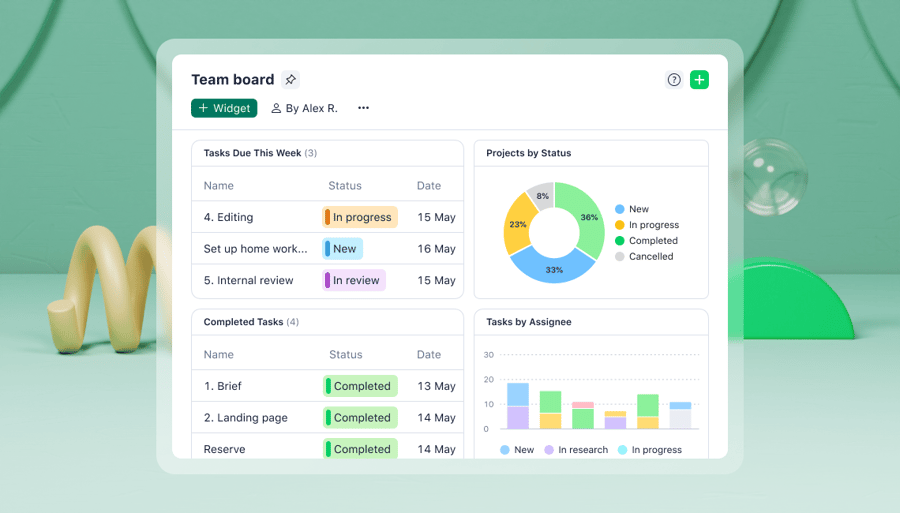
2. Add prebuilt widgets
Our in-house work management experts created a wide range of widgets that you can use to turbocharge your dashboard. They’re broken into three categories (personal work, work management, and projects) and include:
- To-do today/this week: Understand instantly what needs to be done first
- Overdue tasks: Monitor tasks that have gone past their due date
- My pending reviews: Get a quick idea of what’s outstanding
- Activity stream: Visualize all that’s going on in your personal or team workflow
- My backlog: See a list of all items without assigned due dates
These widgets are a great way of quickly seeing what you should prioritize. They can help you cut out busy work, reducing time spent following up with colleagues, checking on progress, and missing overlooked deadlines.
3. Adapt and adjust widgets
Once you’ve chosen the right widgets, it’s easy to customize them to better suit the way you work.
Resizing widgets is a simple but effective way to highlight key data, maximize screen utilization, and enhance fast comprehension. With so much information competing for our attention, a simple tweak like this can mean that you see vital details first, with more run-of-the-mill information coming second. In some organizations, where situations can change fast, this might afford you the opportunity to spot and address issues before they develop into problems.
You can also expand widget data with custom fields to capture more data points or dimensions. This can help to identify correlations, trends, and patterns as they emerge, directly from your dashboard.
4. Tailor your terms
Working in marketing and dealing with briefs, approvals, and campaigns? Or in IT, where it’s all tickets, resolutions, and sprints? The good news is that you can tailor your Wrike dashboard to whatever language you speak in your workplace.
That might mean clicking on the three dots to personalize your dashboard to something like “Joe Bloggs’ Dashboard” or “My Daily Dashboard.” If you manage a team, you can create dashboards for contributors like “EMEA Analyst’s Dashboard” or “Security Consultant Dashboard.”
You can also rename all the tasks, projects, and spaces within your dashboard to fully reflect your way of working. One important adjustment favored by Wrike customers is the ability to rename statuses. So you can choose the standard “Planned,“ “In progress,” “In review,” or “Completed.” You could also write your own, detailing anything from “With external auditors” to “Awaiting quality control.”
5. Sort and organize
Most organizations assign deadlines for tasks or projects, so dashboards often display their contents based on dates. This usually means that overdue or upcoming projects will be listed first, with later dates falling below.
However, that might not suit your environment, which could prioritize certain tasks, teams, customers, or clients. It’s easy to adapt your dashboard to reflect this by labeling and color-coding items according to their urgency.
You can also collate personal dashboards into one team dashboard so that you can see how the entire group is functioning — what’s in progress, what’s overdue, and what’s completed. It can also help you balance workloads and make sure work is distributed fairly, helping to boost morale and retain key staff.
6. Choose your look
The working world is divided into those who like bright white screens and those who prefer dark backgrounds. Whichever side you land on, adapting your Wrike workspace and dashboard is easy.
Simply click on your personal icon, scroll down to Workplace Appearance, and choose your preferred color scheme. You can select a light or dark appearance or follow your computer’s settings. For a bit more color, choose one of our design themes, which include special holiday versions for Halloween, winter, and International Women’s Day.
You can also view your dashboard vertically (useful for reporting and analyses) or horizontally (ideal for Kanban-like oversight). It’s a flexible canvas you can adapt in many ways as your work evolves and your requirements grow.
7. Share your dashboard
With Wrike, you can share your dashboard in seconds with internal and external stakeholders, eliminating the need for regular catch-up calls, update emails, or progress reports. It’s not one-rule-for-all either, as you can choose between three different access permissions:
- Full: This gives another user total control over your dashboard, including the ability to rename it or delete it. This might be the preferred option for new hires or temporary consultants.
- Editor: These users can change the widgets and filters within your dashboard, which might benefit colleagues who like to view data differently.
- Read only: A great option for updating clients and customers, this means that users can view a shared dashboard but can’t make any changes.
If you’d like to share your dashboard outside of your organization, you can also use a public link and set a password for enhanced security.
8. Slice and dice as you like
We know that every individual and organization has different data needs, which is why we include extra visualization options in your personal dashboard.
You just need to connect your dashboard to your data, which is as easy as creating a dashboard, naming it, and adding a project as a source. Then, it’s just a matter of selecting the right widgets, either from the recommended templates or via a new customized version.
You can then visualize your data however you like with various parameters and filters. For example, you could show results in a table, grouped by date, and filtered by tasks due this month. You could also create a bar chart that measures effort, comparing different teams’ outputs. You can then dive into one team’s dashboard and @mention a member to ask for an update.
We’ve put together a quick video to show you how simple dashboard analytics are to set up — and how powerfully effective they can be.