Key takeaways:
- What is the New Wrike Experience? It’s a redesigned collaborative platform focused on user feedback, enhancing functionality while simplifying the user interface for greater productivity.
- How does design play a role in the New Experience? Inspired by Scandinavian design principles, it emphasizes clean aesthetics, usability, and enjoyment, creating a user-friendly environment.
- What features promote user customization? My Home provides a distraction-free and customizable workspace with Recent, Spaces, and Pinned sections for easier project management.
- How is navigation enhanced? Intuitive navigation and a decluttered layout help users find important work faster, centralizing information on the My Home page.
- What scalability options exist in the New Experience? Space admins can manage their tools, build custom views, and easily navigate between Spaces to improve workflow efficiency.
It’s just one of those unavoidable realities of an enterprise-grade collaborative work management platform. Things get complex.
At Wrike our objective has always been to build a platform configurable and powerful enough to handle any situation and that provides you with the tools you need to do your best work.
However, the inevitable happened. As we deepened the platform’s capabilities to better serve our users, we began to hear that sometimes Wrike had begun to get overwhelming to address these concerns and keep up with the evolving needs of our customers.
As we welcome you to the new Wrike experience, we acknowledge that change can be hard, but progress is powerful and we’re excited to be able to use your feedback to rethink our solution. The New Experience combines the functionality you want with the ease of use you need to be more productive and enjoy your time spent in Wrike even more.
The function of design is letting design function
The first and most obvious change you’ll encounter in the New Experience is the look. A great deal of research and thought went into arriving at a design that was clean, intuitive, and — along with appealing to the eye — inviting.
One of the major sources of inspiration for the look of the New Experience came from Scandinavian design. The primary focus of this design school is functionality, meaning everything is made to be easy to use for everyone. Other facets of applied Scandinavian design are the notion that enjoying the work you do is of vital importance as well as the belief that beautiful things enrich people’s lives.
The goal of this association was to promote design that any Wrike user could effortlessly maneuver through, be productive in, and enjoy. The importance of this balance guided us to create a simple, clean interface that’s accessible to all, with an emphasis on enjoying the created environment.
In the New Experience, we selected a color palette of what we call “intentional colors” or neutral colors — whites and grays — that are intended to soothe the eye, not distract, while the primary color palette and accent colors purposefully draw the eye.
As for the visual hierarchy, the space is partitioned off by clean lines and simple profiles with negative space to promote focus and reduce clutter.
A user-driven focus
The New Experience is based entirely on user feedback. Per your input, we’ve addressed information overload while accommodating your need for better discoverability. We’ve also made Wrike more configurable for a more personalized experience that scales as you add more users and teams — and as your business grows. Whether you’re a power-user overseeing complex, cross-functional workflows, or a team member who needs a better way to collaborate and track your project’s progress, the New Experience makes it simpler for you to get the job done.
Work your way
Everybody is different. Some like black coffee, others prefer tea with lots of cream and sugar. There are those who prefer Marvel over DC. Mac or PC. Point is, we all have our own styles and preferences. Our goal with the new Wrike is to make your experience within the app entirely your own while enabling you to collaborate effectively, all without having to click out of the platform:
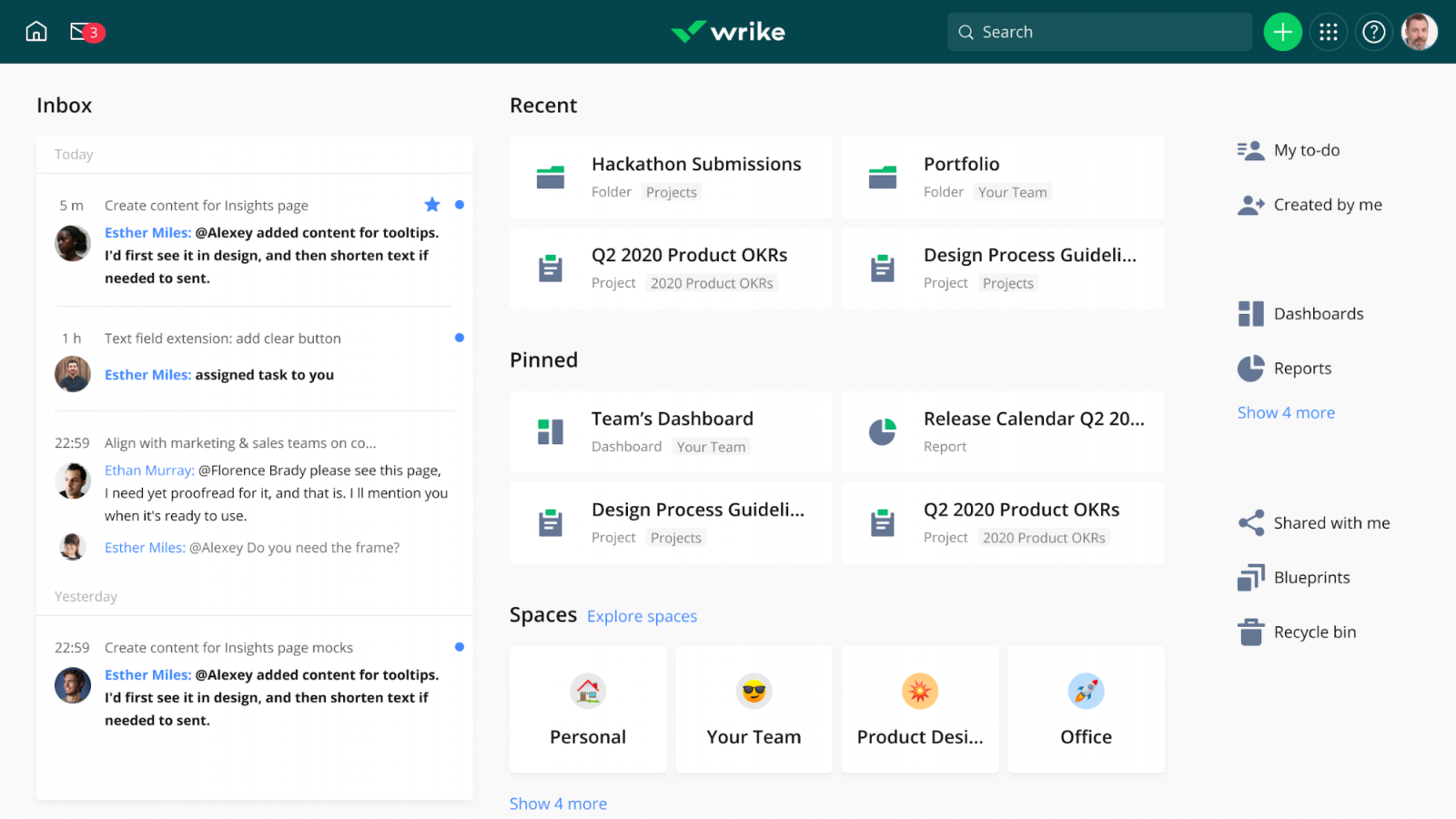
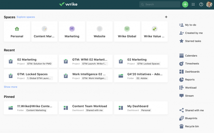
The first place you’ll notice an improvement is when you sign in and are taken to My Home. My Home is a distraction-free, customizable space that you can quickly set up your way and manage your relevant work. With the new Recent, Spaces, and Pinned sections, you can bring your work to you. Recent is where you’ll find the folders, projects, and Spaces you most recently visited, while Pinned is where you can place the tools, projects, folders, and custom views you’ve decided are the most important.
Streamlined for efficiency
You asked to make it easier to find the work that matters most, so we did. We started by designing a more intuitive navigation to help you find things faster and, we think, looks better and is more engaging. We’ve also decluttered your view, made your priorities clearer and easier to access, and generally cleaned things up. We think you’re going to love the new right-hand panel and the fact that everything is centralized on your My Home page:
Scalability simplified
From ensuring access to tools is easier to manage, to making it possible to build structured workspaces while also supporting personalized experiences, the New Experience makes it easy to manage and configure for your entire organization. You can now give Space admins the ability to manage their own tools for greater autonomy. Now teams can build their own dashboards, calendars, or whatever else they might need to get work done more efficiently.
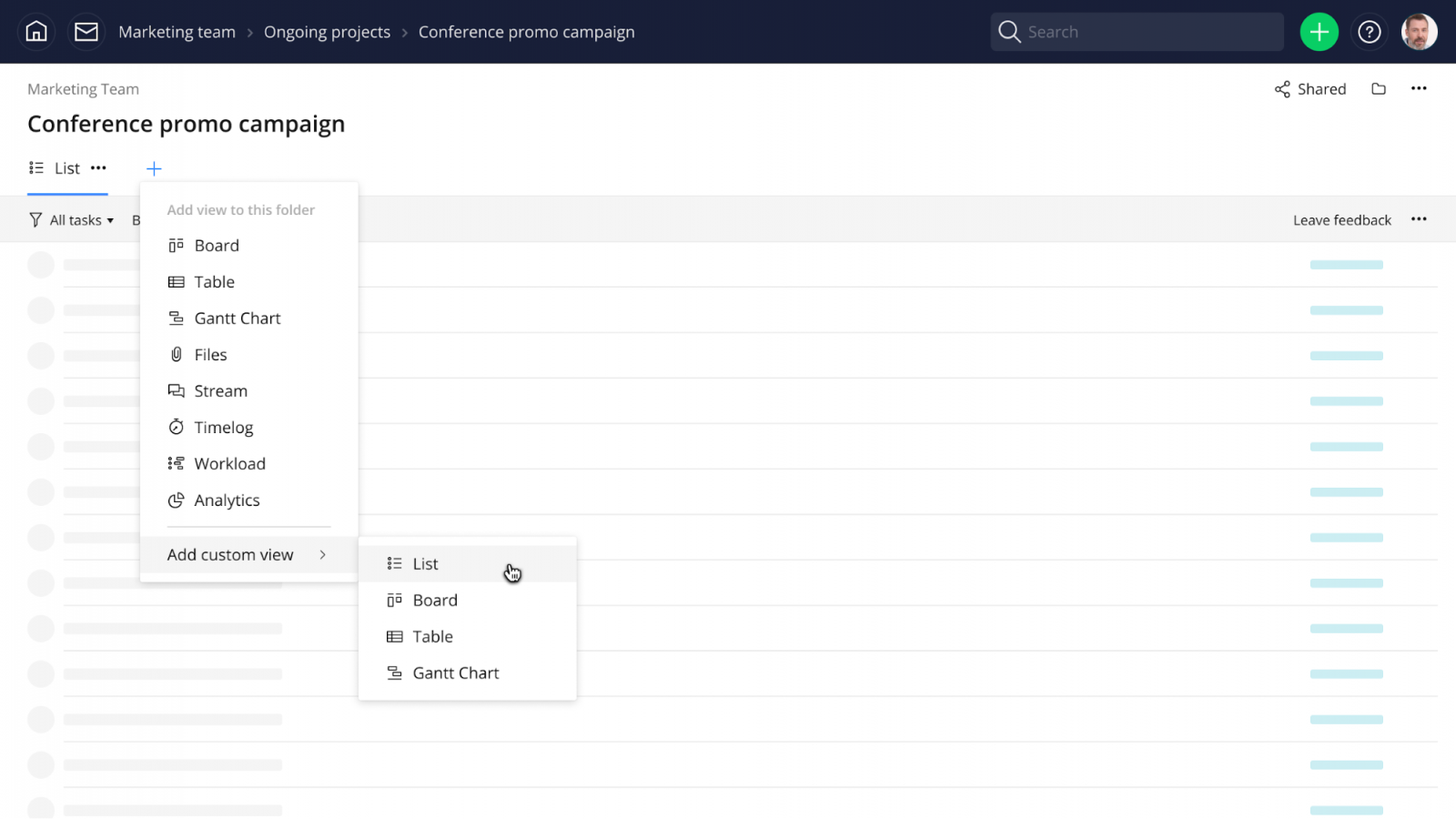
With Custom views, users can select which views are visible for team members and hide all other views by Space, project, and folder:
Once a view is chosen, all team members can access the view without having to create their own view, which helps with scalability.
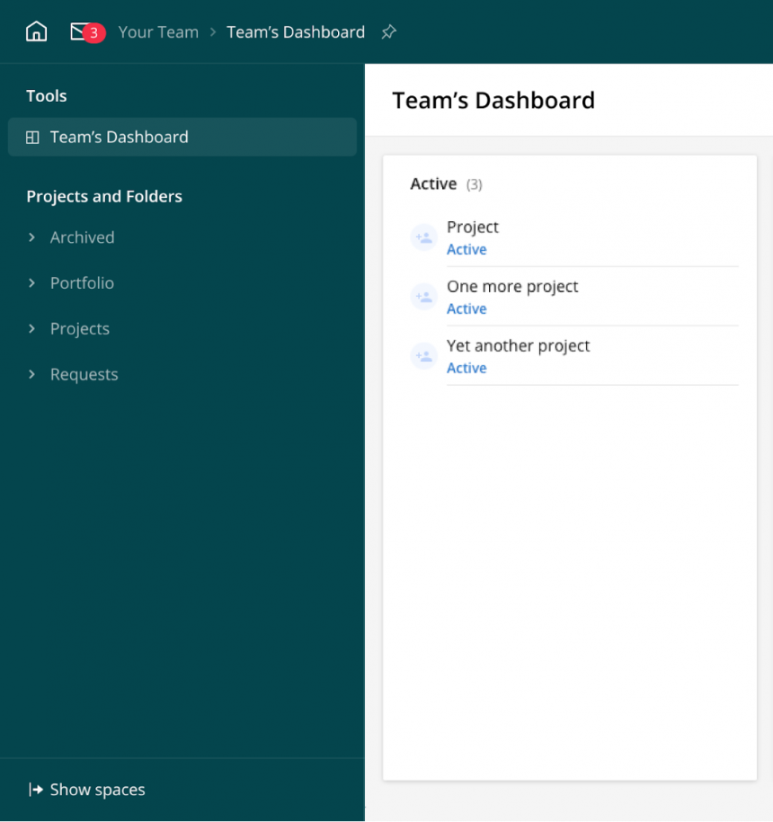
The New Experience is more Space-focused where users can navigate from My Home directly to a dedicated Space of interest. When you’re in a Space, the left-hand navigation will only show work elements of that specific Space:
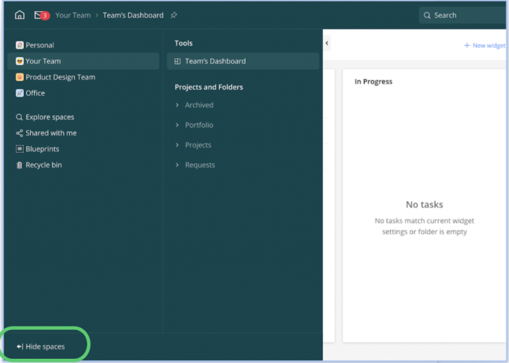
In addition, users can see all the Spaces they belong to for easy navigation between Spaces. Quickly jump from Space to Space by toggling “Show spaces” or focus by clicking “Hide spaces”:
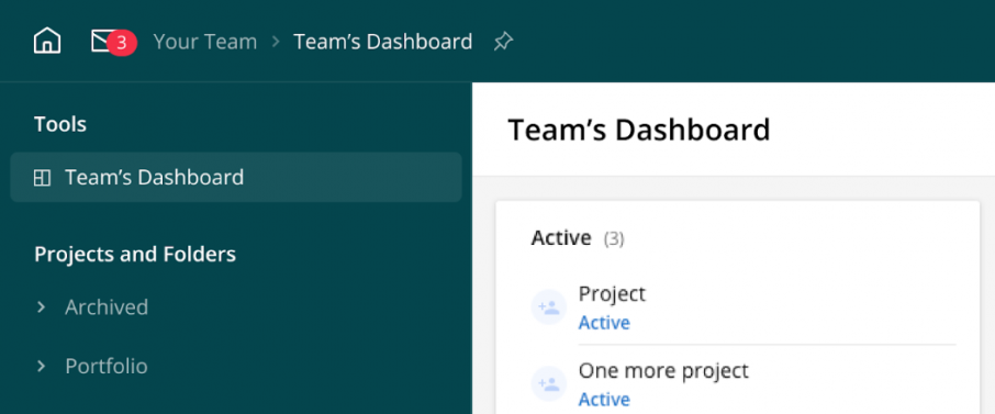
Not only Spaces, users can also navigate between Wrike tools easier, too. The tools that were previously available in Spaces, such as dashboards, are still there in the New Experience. You can find them in the left navigation within a Space and the right side of the My Home screen. You can also pin these items to the Pinned section in My Home:
With the new Wrike, you have a platform that aligns everyone around both organizational goals and the tactical objectives of each team. And with information sharing and accountability built in, Wrike truly is your single source of truth.
The future is now
The launch of the New Experience was a long time coming. We’re proud of being able to give you a better platform, allowing you to personalize your work experience while staying aligned and engaged with your team. We’re confident that it addresses your feedback and delivers what you need. And thank you for your input. We couldn’t have done this without you!
Get things done faster with Wrike!
Wrike is a highly flexible collaboration and project management solution for teams of all sizes.


