They say that small things can make a big difference. That’s why we completely revised the look of the task tab in Wrike, so that every detail contributes to your overall success. Our main goal was making the new layout of task details in Wrike even more compact and intuitive. Let’s take a look at the new and clean task view!
They say that small things can make a big difference. That’s why we completely revised the look of the task tab in Wrike, so that every detail contributes to your overall success. Our main goal was making the new layout of task details in Wrike even more compact and intuitive. Let’s take a look at the new and clean task view!
New exciting features
First of all, we are happy to empower your day-to-day work with some fantastic productivity features described in detail in separate posts:
- The ability to set task dependencies right from the task
- The new built-in timer
Bringing the most important features to your fingertips
Now you’ll have all of the important elements at your fingertips and you’ll able to manage your tasksmuch quicker. For example, now, as an alternative to choosing a task status from a dropdown menu, you can mark it as completed with a single tick.
Task icons are now organized in two groups:
1) Right under the task name you can find task attributes, such as the due date, timer and task time entries, task dependencies, and people with whom it is shared. If you want to make a task backlogged or turn it into a milestone, click on the date picker to choose one of these options.
2) Task actions, such as following task or referencing to it, are brought together in the upper-right corner of the task details pane. They now have attractive new icons that make them even more convenient to use. Besides easy referencing, if you click on the permalink icon, you’ll also get a unique email address for this task which you can use for sending your updates via email.
Additional actions are gathered in the drop-down menu under the dots icon. Here you can make the task recurrent, set its importance, request a status update, print or delete a task. There’s also a new option “Close task”. By choosing it, you close the task tab and get back to the folder statistics in the right pane.
The new look of the task list

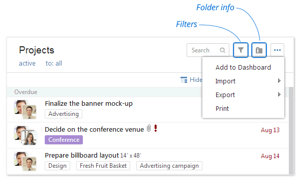
As you have probably noticed, the icons in the task list have changed as well. Here you can see a redesigned filter icon, as well as two new icons. One of the new icons is folder info, which has been moved from the top panel and enables you to look through the folder details in the right pane the same way as tasks. The second new icon, the dots icon, opens a drop-down menu with import, export and print options for the task list.
Can’t wait to see the new interface in action? Simply enable Wrike Graphite for your workspace in Wrike Labs right now!
Important note: The old user interface will be disabled for all users on September 30, 2013. We wanted to make sure that you have plenty of time to get adjusted to the new Wrike. Keep in mind, our customer care team is always there to help you with any questions or concerns that you might have!


